Stemplot (Stem-and-Leaf Diagram)
The stemplot is a quick and easy way to summarize numerical data. A stemplot, like a histogram, can give you a quick sense of the center, shape and spread of the data.
Let's start with some raw numerical data. Assume we collected the ages from 15 members of a certain church choir and obtained the following ages: 15, 15, 16, 20, 23, 23, 24, 26, 26, 28, 31, 34, 36, 43, 43.
A stemplot divides each data value into its stem and its leaf. For this example, all three of the teenagers share a common stem of "1." Each of the 15-year-old members would have a stem of "1" and a leaf of "5," and the 16-year-old member would have a stem of "1" and a leaf of "6." Similarly, the stem for all seven of the people in their twenties would be "2," and then each individual's leaf would come from the second digit of their age.
Each data value is divided into a stem part and a leaf part. All data values with the same stems are listed together on one line of the stemplot. Here's our stemplot of ages of all 15 people in the church choir:
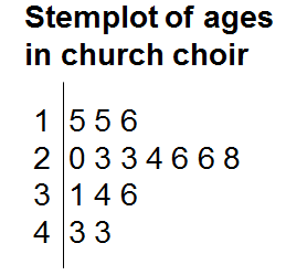
Notice that the stem numbers represent the tens digits of the ages of the members of the choir. The leaf numbers are the units digits of those ages. We'd interpret the numbers of the second row as the following ages: 20, 23, 23, 24, 26, 26, and 28. Notice, too, that there is a vertical line that separates the stems from the leaves.
The stemplot allows us to quickly see how many people fell into each age category. We see there were 3 members in their teens (15, 15, 16), 7 members in their twenties (20, 23, 23, 24, 26, 26, 28), 3 members in their thirties (31, 34, 36), and 2 members in their forties (43, 43). A special benefit of a stemplot is that, even though the data are summarized in a table, you still know each individual data value.
From the stemplot, you can quickly see the center of the distribution (high 20s) and the spread - the range is from age 15 to age 43, a difference of 28 years. The shape can be seen more easily if you turn your head 90 degrees to the right and look at the stemplot, and you can see that the shape is tall in the middle and tapering down on either side of the middle.
The stemplot is an easy but informative way of displaying numerical (quantitative) data.
Let's start with some raw numerical data. Assume we collected the ages from 15 members of a certain church choir and obtained the following ages: 15, 15, 16, 20, 23, 23, 24, 26, 26, 28, 31, 34, 36, 43, 43.
A stemplot divides each data value into its stem and its leaf. For this example, all three of the teenagers share a common stem of "1." Each of the 15-year-old members would have a stem of "1" and a leaf of "5," and the 16-year-old member would have a stem of "1" and a leaf of "6." Similarly, the stem for all seven of the people in their twenties would be "2," and then each individual's leaf would come from the second digit of their age.
Each data value is divided into a stem part and a leaf part. All data values with the same stems are listed together on one line of the stemplot. Here's our stemplot of ages of all 15 people in the church choir:
Notice that the stem numbers represent the tens digits of the ages of the members of the choir. The leaf numbers are the units digits of those ages. We'd interpret the numbers of the second row as the following ages: 20, 23, 23, 24, 26, 26, and 28. Notice, too, that there is a vertical line that separates the stems from the leaves.
The stemplot allows us to quickly see how many people fell into each age category. We see there were 3 members in their teens (15, 15, 16), 7 members in their twenties (20, 23, 23, 24, 26, 26, 28), 3 members in their thirties (31, 34, 36), and 2 members in their forties (43, 43). A special benefit of a stemplot is that, even though the data are summarized in a table, you still know each individual data value.
From the stemplot, you can quickly see the center of the distribution (high 20s) and the spread - the range is from age 15 to age 43, a difference of 28 years. The shape can be seen more easily if you turn your head 90 degrees to the right and look at the stemplot, and you can see that the shape is tall in the middle and tapering down on either side of the middle.
The stemplot is an easy but informative way of displaying numerical (quantitative) data.
|
Related Links: Math Probability and Statistics The Back-To-Back Stemplot Bar Chart Histogram Make Predictions - Probability Quiz Permutations Example |
To link to this Stemplot (Stem-and-Leaf Diagram) page, copy the following code to your site: