Scatterplot
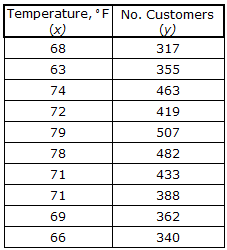
A scatterplot is used when we have pairs of data whose variables might have a relationship. For example, we might want to study the relationship between the outside temperature at noon and the total number of customers at an ice cream shop for a number of days. Here are the raw data in a chart and the resulting scatterplot when each pair of data is plotted.
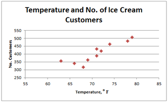
We see that for low temperatures, there are fewer customers, and when the temperature is higher, there are more customers. We call this a positive relationship between the temperature and the number of customers. That is, as the temperature goes up, the number of customers goes up. Notice that the data points on the scatterplot show a trend that increases up and to the right. This indicates a positive relationship between the two variables.
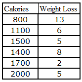
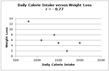
There can also be a negative relationship between two variables. Consider the relationship between your daily calorie intake and the amount of weight you lose. In this case, the more calories you consume, the less weight you will lose. Here are a chart of data values and the scatterplot:
We see that for low temperatures, there are fewer customers, and when the temperature is higher, there are more customers. We call this a positive relationship between the temperature and the number of customers. That is, as the temperature goes up, the number of customers goes up. Notice that the data points on the scatterplot show a trend that increases up and to the right. This indicates a positive relationship between the two variables.
There can also be a negative relationship between two variables. Consider the relationship between your daily calorie intake and the amount of weight you lose. In this case, the more calories you consume, the less weight you will lose. Here are a chart of data values and the scatterplot:
|
Related Links: Math Probability and Statistics Contingency Table Correlation and the Correlation Coefficient |
To link to this Scatterplot page, copy the following code to your site: