Pie Chart
One of the simplest graphs that can be used to display summarized data is the pie chart. It displays either categorical or numerical data in an easy-to-read chart, with the size of each piece of the pie based on the frequency of each category. In other words, each "slice" of the pie shows us visually what proportion that slice is of the whole pie.
Pie charts are almost always used when it is informative to visually see information about percentages of some whole. For example, let's assume we are interested in analyzing the dates stamped on 2,000 randomly-selected pennies. We first record each penny's date by the decade when it was minted and then summarize the data into a simple table.

Note that the calculation of the relative frequency is found by dividing the frequency by the total. Then, we calculate the percent by moving the decimal point to the right two places.
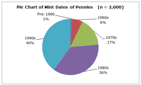
The data in the table can easily be converted into a pie chart. Here is a pie chart prepared from the mint dates of those 2,000 randomly-selected pennies.

Observe that the pie chart is very helpful when it comes to information about percentages. We can easily see that the largest percentage of those 2,000 pennies (40% of them) were minted in the 1990s. We can also see that only 1% of those pennies were minted prior to the 1960s.
Pie charts are almost always used when it is informative to visually see information about percentages of some whole. For example, let's assume we are interested in analyzing the dates stamped on 2,000 randomly-selected pennies. We first record each penny's date by the decade when it was minted and then summarize the data into a simple table.

Note that the calculation of the relative frequency is found by dividing the frequency by the total. Then, we calculate the percent by moving the decimal point to the right two places.
The data in the table can easily be converted into a pie chart. Here is a pie chart prepared from the mint dates of those 2,000 randomly-selected pennies.

Observe that the pie chart is very helpful when it comes to information about percentages. We can easily see that the largest percentage of those 2,000 pennies (40% of them) were minted in the 1990s. We can also see that only 1% of those pennies were minted prior to the 1960s.
To link to this Pie Chart page, copy the following code to your site:
