Correlation and the Correlation Coefficient
We have looked at scatterplots and determined what the shape of the data communicated to us. We saw that sometimes data show a positive relationship and sometimes a negative relationship. This relationship is often referred to as the correlation between the two variables. For example, we saw a positive correlation between the daily temperature at noon and the number of customers at an ice cream shop.
It's not enough to say that two variables show a positive or negative correlation. We want to be more specific about that relationship. That is, we want to be able to think about the relationship between two variables in a more quantitative fashion. For example, if two variables exhibit a positive correlation, how strong is that correlation? We're going to see that a positive correlation can have different strengths. Similarly, if two variables are negatively correlated, how strong is that correlation? Negative correlations also have varying degrees of strength.
We measure the degree of correlation with a value referred to as r, which is called the correlation coefficient. This variable r simply tells us how strong a certain relationship is. When we plot data on a scatterplot, there are many software packages, including Excel, that will calculate the value of r based on the data we have input. We don't need to know how to calculate r, but we do need to understand what it tells us.
The correlation coefficient, r, can range from -1 to +1. When r = +1, there is a perfect positive correlation between two variables. When r = -1, there is a perfect negative correlation between two variables. When r = 0, there is no correlation between the variables. In reality, it's very rare to find r values of +1 or -1; rather, we see r values somewhere between these two extremes. For example, if we determined that two variables had an r value of 0.91, for all practical purposes, that would indicate a very strong, but not perfect, positive correlation between the two variables. Similarly, an r value of -0.94 would indicate a very strong, but not perfect, negative correlation between the two variables.
Consider the 5 scatterplots below, which are examples of various correlations. Note that in each scatterplot a line has been drawn. In some graphs the data points are either on or near the line and in others the data points are farther from the line.
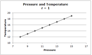
Let's consider the relationship between the temperature of a gas and the pressure of the gas. There's a perfect positive correlation between these two variables. Notice that every point on the graph lies on the line. Also notice that since a perfect positive correlation exists, r = 1.
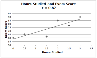
Now consider the relationship between the number of hours studied and the exam score earned. Notice that there's a pretty strong positive correlation between the two variables (r = 0.87), but it is not perfect. In other words, the number of hours studied is a very good predictor of exam score, but it's not perfect. There could be some people who study many hours and still earn a low exam score, and there could be people who study less than an hour or don't study at all yet earn a high exam score.
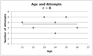
Consider the relationship between the age of a person and the number of attempts he or she makes at opening a lock. Notice that there is no correlation between these two variables. That is, a person who is 16 years old does not appear to try more times to open the lock than a person who is 11 years old. Notice that since there is no correlation between the two variables, r = 0.
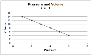
Here, the pressure and the volume of a gas give us a perfect negative relationship (r = -1). That is, as the pressure of the gas increases, the volume decreases. Notice that every point on the graph lies on the line.
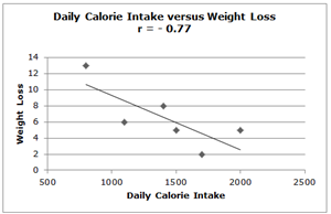
Finally, consider this scatterplot of daily calorie intake vs. weight loss. Because r = -0.77, we see there is a pretty strong, although not perfect, negative relationship between these two variables. In other words, for the most part, when one increases his or her daily calorie intake, there is not as much weight lost. However, since the relationship is not a perfect one, there could be some people who have a high daily calorie intake yet they could have some weight loss.
From the scatterplots above, we see that when r = +1, every point on the scatterplot lies on a line that has a positive slope. When r = -1, every point on the scatterplot lies on a line that has a negative slope. Notice that when r = 0, the points appear to exist in a random fashion around the line but with no clear connection to the line.
It's not enough to say that two variables show a positive or negative correlation. We want to be more specific about that relationship. That is, we want to be able to think about the relationship between two variables in a more quantitative fashion. For example, if two variables exhibit a positive correlation, how strong is that correlation? We're going to see that a positive correlation can have different strengths. Similarly, if two variables are negatively correlated, how strong is that correlation? Negative correlations also have varying degrees of strength.
We measure the degree of correlation with a value referred to as r, which is called the correlation coefficient. This variable r simply tells us how strong a certain relationship is. When we plot data on a scatterplot, there are many software packages, including Excel, that will calculate the value of r based on the data we have input. We don't need to know how to calculate r, but we do need to understand what it tells us.
The correlation coefficient, r, can range from -1 to +1. When r = +1, there is a perfect positive correlation between two variables. When r = -1, there is a perfect negative correlation between two variables. When r = 0, there is no correlation between the variables. In reality, it's very rare to find r values of +1 or -1; rather, we see r values somewhere between these two extremes. For example, if we determined that two variables had an r value of 0.91, for all practical purposes, that would indicate a very strong, but not perfect, positive correlation between the two variables. Similarly, an r value of -0.94 would indicate a very strong, but not perfect, negative correlation between the two variables.
Consider the 5 scatterplots below, which are examples of various correlations. Note that in each scatterplot a line has been drawn. In some graphs the data points are either on or near the line and in others the data points are farther from the line.

Let's consider the relationship between the temperature of a gas and the pressure of the gas. There's a perfect positive correlation between these two variables. Notice that every point on the graph lies on the line. Also notice that since a perfect positive correlation exists, r = 1.

Now consider the relationship between the number of hours studied and the exam score earned. Notice that there's a pretty strong positive correlation between the two variables (r = 0.87), but it is not perfect. In other words, the number of hours studied is a very good predictor of exam score, but it's not perfect. There could be some people who study many hours and still earn a low exam score, and there could be people who study less than an hour or don't study at all yet earn a high exam score.

Consider the relationship between the age of a person and the number of attempts he or she makes at opening a lock. Notice that there is no correlation between these two variables. That is, a person who is 16 years old does not appear to try more times to open the lock than a person who is 11 years old. Notice that since there is no correlation between the two variables, r = 0.

Here, the pressure and the volume of a gas give us a perfect negative relationship (r = -1). That is, as the pressure of the gas increases, the volume decreases. Notice that every point on the graph lies on the line.

Finally, consider this scatterplot of daily calorie intake vs. weight loss. Because r = -0.77, we see there is a pretty strong, although not perfect, negative relationship between these two variables. In other words, for the most part, when one increases his or her daily calorie intake, there is not as much weight lost. However, since the relationship is not a perfect one, there could be some people who have a high daily calorie intake yet they could have some weight loss.
From the scatterplots above, we see that when r = +1, every point on the scatterplot lies on a line that has a positive slope. When r = -1, every point on the scatterplot lies on a line that has a negative slope. Notice that when r = 0, the points appear to exist in a random fashion around the line but with no clear connection to the line.
|
Related Links: Math Probability and Statistics Normal Distribution - Advanced Probability Calculation Using a z Table Normal Distribution - Real-World Problems Using z Values |
To link to this Correlation and the Correlation Coefficient page, copy the following code to your site:
