Bar Chart
A Bar Chart is one of the simplest ways to display data. First, we need to understand the difference between categorical data (also called qualitative) and numerical data (also called quantitative). Categorical data puts the data into non-numerical categories, such as color, gender, grade on an exam, or type. The color of a car or the breed of a dog would be examples of categorical data. Numerical data, on the other hand, puts the data into numerical categories, such as age, price, height, or number. Some examples of numerical data are the heights of girls in a particular classroom or the number of children in a family.
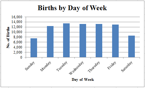
A Bar Chart is used to display categorical data. Generally, the category is listed on the horizontal axis, and the frequency or the relative frequency is on the vertical axis. In this case, the day of the week is the category, and the number of births corresponding to each day is the frequency. We make each bar the same width. The height of each bar depends on the number of births for each day of the week. It is important to note that the bars of a Bar Chart are separated and do not touch. Here is a typical Bar Chart.

Notice that as we scan the chart from left to right, we can see that Tuesday has the most births, while Sunday has the fewest. Also notice that the frequency of each category is plotted on the vertical axis. For example, there were a little more than 7,500 births on Sunday. The Bar Chart also tells us at a glance that there are fewer births on weekends (Saturday and Sunday) than during the week, because the heights of the Saturday and Sunday bars are lower than the heights of the bars for weekdays.
The Bar Chart is a simple but useful way to display categorical data.
A Bar Chart is used to display categorical data. Generally, the category is listed on the horizontal axis, and the frequency or the relative frequency is on the vertical axis. In this case, the day of the week is the category, and the number of births corresponding to each day is the frequency. We make each bar the same width. The height of each bar depends on the number of births for each day of the week. It is important to note that the bars of a Bar Chart are separated and do not touch. Here is a typical Bar Chart.

Notice that as we scan the chart from left to right, we can see that Tuesday has the most births, while Sunday has the fewest. Also notice that the frequency of each category is plotted on the vertical axis. For example, there were a little more than 7,500 births on Sunday. The Bar Chart also tells us at a glance that there are fewer births on weekends (Saturday and Sunday) than during the week, because the heights of the Saturday and Sunday bars are lower than the heights of the bars for weekdays.
The Bar Chart is a simple but useful way to display categorical data.
|
Related Links: Math Probability and Statistics Histogram Pie Chart Stemplot (Stem-and-Leaf Diagram) Probability of Dependent Events Halloween Probability Quiz |
To link to this Bar Chart page, copy the following code to your site:
