The Histogram
The key word here is INTERVALS. If there are no intervals of data, then you would not use a histogram.
Check out this example:
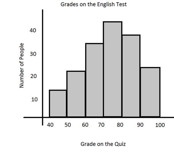
Here we have grouped all the grades between 50 and 59 into an interval, instead of making one bar for each possible grade.
Histograms are a great choose when there is a large range of data and making a bar for each value would be confusing to look at.
Let's answer some questions using the histogram.
1.) How many people scored 80% of higher on the English test?
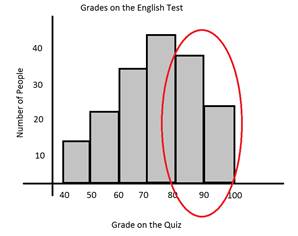
There are 37 people that scored in the 80s and 25 that scored in the 90s.
37 + 25 = 62 people that scored 80% or higher on the English test.
37 + 25 = 62 people that scored 80% or higher on the English test.
2.) Describe the spread of the data.
Notice that the data has a curve to it. There are more people in the center of the data between 60% and 90%. There are less people on the ends, scoring really low or really high.
3.) What is the lowest score?
Because we cannot see the exact scores, we don't know the lowest score, but we can tell that there are no scores lower than 40%.
4.) Which interval has the most scores?
The tallest bar is for the 70-79 interval. So more people scored in this interval than any others.
Now let's look at making a histogram.
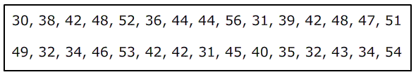
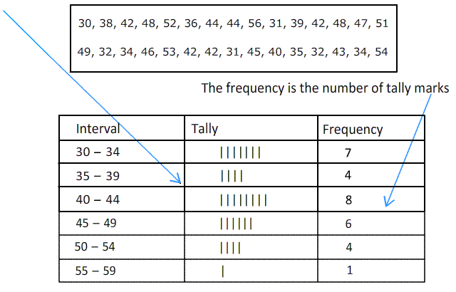
Example: Below are the height of 30 children.
Step 1: Determine the range. (This will help us determine if we should make a histogram or a regular bar graph.
Recall that the range is the highest score minus the lowest score. 56 - 30 = 26
Notice that it isn't a huge range, however it is big enough that we need intervals. We cannot make a bar graphs with 26 bars.
Step 2: Determine the intervals.
Since the range is 26, we can see that intervals of 10 would only give us 3 bars.
This is not quite enough. So we will go with intervals of 5.
Since the lowest score is 30, we will make this the beginning of the intervals.
30 - 34
35 - 39
40 - 44
45 - 49
50 - 54
55 - 59
Notice that the first number in each interval counts up by 5s!
Step 3: Create a frequency table. This will help organize your data!
Make a tally mark for each score from the list.
Step 4: Make the histogram.
The intervals go across the x-axis. The frequency goes up the y-axis.
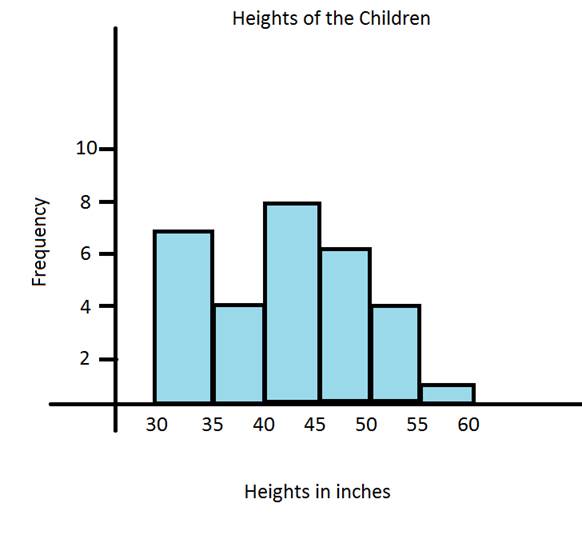
The frequency told us how tall to make each bar. Notice that there are labels, a title, and that each bar is the same width. These are all important pieces to making a proper histogram.
Let's Review:
A histogram is a special types of bar graph that shows intervals of data. The bars in a histogram touch. You cannot actually see each data value from the set, but you can visually see groups of data.
Related Links:
Math
Fractions
Factors