Reading Box Plots
Here is an example:
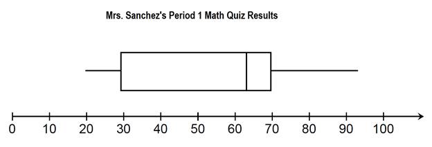
You might notice that this plot has a box in the center and a whisker on either side.
There are 5 key points on the plot.
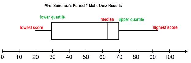
Here we can see that the lowest score on the quiz was a 20%. The highest score is about 93%.
Then there are three other numbers given. The median, in the middle, tells us that half of the student scored a 63 or lower and half the students scored a 63% or higher.
Next come the quartiles. The box plot is divided up into 4 sections. Each section represents 25% of the class.
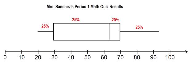
Let's make a list of facts that we can gather from the box plot.
- 25% of the class scored 30% or lower.
- 25% of the class scored a 70% or higher.
- 50% of the class scored a 63% or higher.
- 50% of the class scored between 30 and 70.
- 75% of the class scored below 70%
- 25% of the class scored a 70% or higher.
- 50% of the class scored a 63% or higher.
- 50% of the class scored between 30 and 70.
- 75% of the class scored below 70%
There are many other statements we could make. This is just an example of some of the information we have been given.
Examples:
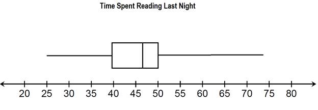
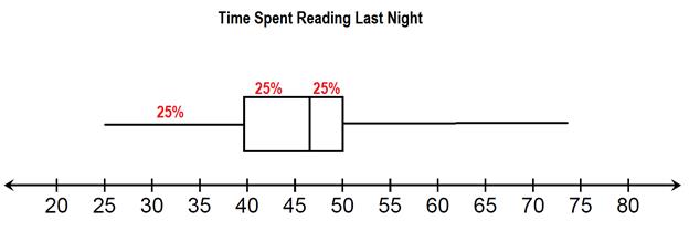
Question #1: Give a 5 point summary from the data.
Solution:
The least amount of time spent reading is 25 minutes.
The most time spent reading is 74 minutes.
The median amount of time spent reading is 46 minutes.
The lower quartile is 40 minutes.
The upper quartile is 50 minutes.

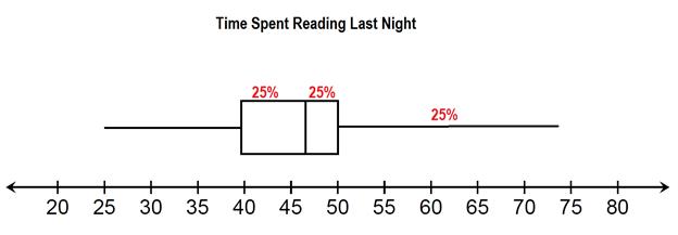
Question #2: Explain what the box represents in the box and whisker plot.
Solution:
The box shows that 50% of the people asked spent between 40 and 50 minutes reading last night.
Question #3: Fill in the blank
________% of the people surveyed spent 50 minutes or less reading last night.
________% of the people surveyed spent 40 minutes or more reading last night.
Solution:
For the first blank, we have three sections of the graph at 50 or below. Each section is worth 25%, making 75% total.
75% of the people that responded also read for 40 minutes or more.
Notice that in this example, 25% can be taken up be a very small box or a very long whisker. When the box is smaller, this shows that many people answered within a small range of times. A long whisker shows that there was a larger range of answers.
Example 2
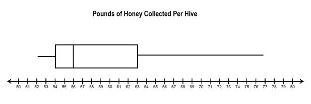
Question #1: Give a 5 point summary of the data shown in the box plot.
Solution:
The smallest amount of honey collected was 52 pounds.
The largest amount of honey collected was 77 pounds.
The median amount of honey collected was 56 pounds.
The lower quartile is 54 pounds.
The upper quartile is 63 pounds.
Question #2: What percent of the hives brought in 56 or more pounds of honey?
Solution:
Because 56 is the median, this means that 50% of the hives collected 56 pounds of more.
Question #3:
What percent of the hives brought in 63 pounds of honey or more?
What percent of the hives brought in 63 pounds of honey or less?
Solution:
Because 63 is the upper quartile, that means that 25 % of the hives brought in more and 75% brought in less.
Let's Review:
Box Plots are a unique way of displaying data using medians. The box shows 50% of the data values that are located around the median. The whiskers also represent 50% of the data. 25% is before the box and 25% is after the box.
There are 5 key points shown on a box and whisker plot:
Lowest point (minimum)
Lower quartile
Median
Upper quartile
Highest point (maximum)
These 5 points can be used to describe the data.
Related Links:
Math
Fractions
Factors